It's here! It's FINALLY here!!
These ladies have worked long and hard on these amazing projects, but before I turn the time over to them let me give you a quick run down of how this is all going to work.
First, scroll down and feast your eyes upon the splendor these ladies have created just for you.
Next, pick your 2 favorite projects. Now do all these ladies a favor and pick fairly :) You are judging based on talent, not blog "status".
Once you have your favorite 2 picked, VOTE in the poll located in the top right corner. You will only be allowed to vote 1 time so choose wisely, However you are still voting for your top 2.... so pick 2 (have I drilled that into your head yet? :)
You will not be allowed to put your 2 votes into the same project. They must be 2 seperate projects. You will vote for your top 2 favorites ever week for the first half of the competition. On week 6 it will switch to only 1 vote for the remainder of the competition.
The polls will remain open until Friday at midnite, MST.
On SATURDAY the winner will be announced and will win immunity from next weeks elimination, as well as a prize from a wonderful sponsor assuming of course that there is a sponsor scheduled for that week.
Unfortunately we will also have to send 1 person "home" :(
However, you will still get to hear from them 1 more time as that person will say their goodbyes with a project that will introduce next weeks theme. And of course you can always visit them on their blog! :)
Then SUNDAY night we will start all over again with a new theme, and the remaining contestants.
Sound good?
OK......
Now onto this week's theme:
[ACCESSORIES]
The rules this time were simple:
showcase an accessory you've made, or a place you've accessorized.
showcase an accessory you've made, or a place you've accessorized.
All 10 of these ladies have done an amazing job! Prepare to be inspired!
You may be thinking "how can I possibly choose only 2?!" Well since we are at the very beginning and this is your first time voting I'll give you some suggestions to help you decide:
*Which project/idea "speaks" to you the most?
*Which project/idea do you consider the most appealing and creative?
*Which project/idea do you consider the most appealing and creative?
*Who do you think did the best job at really capturing the theme they were given? (see the rules to the theme above)
And with that in mind I will turn the time over to who you really came here to see.... so without further ado....
The Season 1 Contestants!!!
#1- Pillows
For those of you who don't know what All Things Thrifty is all about, we are decorating gals who can't get enough of Interior Design. We are THRIFTY to the core, and we love to share our ideas of how to decorate on a budget. We will share with you how much our projects cost to prove how inexpensive decorating can really be!
Pillow, n: 1. A cloth case, stuffed with something soft, such as down, feathers, or foam rubber, used to cushion the head, especially during sleep. 2. A decorative cushion.
We LOVE to decorate with pillows, and accessorizing with them is one of our favorite parts of decorating a room. The right pillow can tie in the decorations of an entire room and make it feel complete. We'd like to show you five different accessories that could dress up any old pillow and take it from drab to FAB!
Our first pillow is one we made from fabric purchased from IKEA and felt purchased from a local craft store. Felt is a fun and inexpensive way to spice up your pillows. The felt we used on these pillows, came to a total of $1.74. Just by adding that small amount of felt, it changed these pillows from blah to beauty. The overall cost for this pillow cover was under $5.00.

Our next fun pillow is one with classic charm. By adding some DIY vintage flowers to the front of the pillow and crystal tassel trim to the sides, the pillow becomes a focal point of your decor. Kallie found all the fabric for the small price tag of a $1 a yard for this beauty. So for a GRAND TOTAL of $2.01 for all the ingredients, you can have a darling vintage pillow cover from scratch.
 Creating a pin-tuck pillow is extremely easy and it is SOOOO cute. To top off the cute-ness, what if we told you the total cost was 50 cents?? Makes it that much better right? Kallie bought the fabric for 1.00 a yard and she used 1/2 a yard to make this fun pillow cover! I just love the pin-tuck texture. Once you learn how to create the "pin-tuck" think of all the possibilities...bedspreads, curtains, shower curtains etc. Let your mind go crazy with ideas!!
 We made this fun pillow by cutting small circles of felt and scrunching them up to create this fun "flower" look. The total cost of this pillow cover was around $3.00.
 This ruffly beauty was inspired by a pillow I saw at the local Parade of Homes. I tea-dyed the lace to make it look antique, and wrapped it spirally on the pillow to create the ruffle flower. Although this pillow was our most expensive project, this pillow cover only cost us $8.25 to make!
For details on how we made each of these pillows CLICK HERE. There you will find step-by-step picture tutorials and a cost breakdown for each pillow cover. Thanks for letting us share our love of "thrifty designing" with you!
#2- Ceramic Clock
For this weeks challenge "Accessory" I decided to make a clock that would fit into my living rooms shabby chic decor. I made the clock using a vintage ceramic ceiling medallion along with a porcelain floral plate.
I found the vintage ceramic ceiling medallion at a flea Market for $5.00 and the floral plate for .25 cents at an estate sale.
I drilled a hole into the plate using a ceramic drill bit, this is the first time I've ever drilled into ceramic/porcelain and I must say it was very easy. The important thing is to go slow so it doesn't break.
I drilled a hole into the plate using a ceramic drill bit, this is the first time I've ever drilled into ceramic/porcelain and I must say it was very easy. The important thing is to go slow so it doesn't break.
I then added a strong epoxy to glue the 2 pieces together and added a clock kit that I purchased for $4.99.
So for under $10.50, I have a lovely little clock that fits perfectly in my space.
#3- Vintage Kitchen Gadgets
Kitchen Accessories- My Kind of Accessory!
Any one who knows me, knows two things: I love to cook and I love kitchen gadgets. Particularly vintage gadgets and rolling pins. I have totes and totes of both in storage from the move. Packed away 3 years now, I know the cruelty! As my kitchen gets closer to completion, family and friends have been busy spring cleaning their kitchens, passing their junk on to me. YEAH!
My kitchen is still in construction mode. I have yet to decide on the counter top.
Along with all the wonderful accessories shown in this photo, I was able to get a few
larger old chippy window frames while helping my dad clean his many work areas.
My goal was to create a wall collage using a couple different sizes of the window frames to display my collection of kitchen gadgets. See that unfinished white box switch?
It goes to my commercial fans and prevents me from using one of my favorite window frames. Fear not, I will put it to use elsewhere. This is what I found to use in it's place.
Isn't is beautiful? NOT! Determined to stay with in the budget of $0.00 spent on this project, I sacrificed this lovely by popping the picture out of the frame, turned it over, painted the back of the picture with the same paint that I used on my kitchen door and cut out a spot for the white box fan switch. I know, I'd love to paint the white box or cover it, but my goal is to obtain a commercial license and the state has some real funky laws about what I can and cannot do.
As a professional chef, I like stainless steel. I know, many say it's on it's way out.
Not in the commercial kitchen. The kitchen in the home we sold was white on white.
With this kitchen, I knew I wanted the benefits and appearance of stainless paired with the warmth of natural stone and wood tones. I was ready for a change. In the planning of this project, Miss Sarah spied stainless peg board and immediately called me.
Be Still My Heart!
It was designed with the mechanic in mind, I wanted it in my kitchen.
It was designed with the mechanic in mind, I wanted it in my kitchen.
I think even the best mechanic would be hard pressed to determine that my spray painted peg board was not the real deal.
I added the hand forged handle to add dimesion and texture.
I added the hand forged handle to add dimesion and texture.
I still have 5 feet above to accessorize with all the beauties waiting to arrive from their vacation in the storage unit.
oh, I laugh at myself, how silly I can be!
For more of my ongoing renovation visit me at Welcome to the Turner Farm
#4- Doorway Decorating
Hi, my name is Gina from The Shabby Chic Cottage. I am thrilled to be included in such a talented group of ladies! I am not a real decorator, I just play one on the internet. I'm super excited to be in the first So You Think You Can Decorate.
I love unexpected touches. They are probably my most favorite part of decorating. It's all about bringing a little smile to your face, and that of guests to your home. Hanging objects over doorways is always a good way to bring a little something extra to a room.
This piece of "molding" is actually a trash-picked piece of a broken headboard. See the little curve? Love that! So I brought it home with me. It moved to a couple of different houses, and finally made it to this house. It hung there for quite some time before I added the black iron piece on top, which I found at Hobby Lobby. Cheap price, pretty results.
To hang it, I simply stapled a strip of scrap fabric on back. I could have put a real hanger there, but I didn't have one. For me it's about using what you have at the time.
An old chippy wooden sign hangs over the hallway. Sweet, simple, about 2 minutes worth of work. This spot gets regular changes, too. I might hang a plate or a seasonal item... something that catches my attention.
Quirky little touches are my absolute favorite. A simple little bird is nestled above the doorway to my laundry room.
He's just wedged into the molding. No hanger. No fuss. Just tucked right in.
To see more of my every day decorating adventures, check out my blog HERE
#5-Accessories Accessory
~An Accessory for Your Accessories~
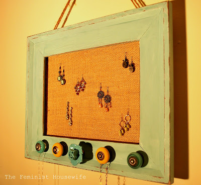
Accessories can make a room a decorating masterpiece, or a complete disaster. Whether fun, pulled-together, eclectic, or classy, the accessories effect and portray the living, breathing, personality of the room. It is no different when an outfit is coordinated. The earrings, necklaces, brooches, or rings tell whether I am flirty and playful, or dark, sultry, and sophisticated. The perfect accessory for your room, can also be perfect for organizing your jeweled accessories.
Using burlap, natural jute, cabinet hardware, and an open-back frame, I created an earring & necklace holder that will match my shabby chic, turquoise, bedroom.
The frame was primed, painted using a "white-wash" technique, and antiqued with sandpaper to add definition to the edges.
I measured and drilled five holes in the bottom portion of the frame for the hardware. I used a combination of hardware styles, all of which can be found at Anthropologie. My personal favorite is the turquoise rose that is in the center of the piece.
For a step-by-step photo tutorial and more fun projects visit The Feminist Housewife!
#6- Unique Office
Welcome to my office, unlike any other. :)
Gone are the days in my home when a dining room is used for eating. This area is now my blog office, with a very funky personality. :) Random objects of desire come together, all playing a much bigger part. A little bit of metal, wood, black and white all harmonize, creating a fun, casual environment that would inspire any junk lovin' blogger! Not that we need the extra enticement...
Even the inside of the two doors of the armoire provide function. Although they can close, I'd never want to do that. :) ( I prefer to face space, rather than a wall ) On the left hangs a bulletin board, also displaying an antique clipboard for some layered interest. The right door houses an old heavy duty metal shower caddy for post it notes and writing materials.
The top row of labeled baskets hide all kinds of office needs. The middle shelf holds a drawer from a dresser, one of the best paper catchers EVER. (groups an entire year of school paperwork before it goes into the year end scrap book) The office sign was created from a picture frame, tongue and groove pine siding, a stencil I created, and acrylic craft paint. The surface of the sign was lightly roughed up to give it a chalkboard appearance. Have you noticed the backing on the armoire? A chunk of metal clad siding, complete with rusty details gives this area a kick of unexpected industrial charm! If that doesn't make you smile, not much would. :)
Inside the armoire, old jars, plates, platters and an antique sewing machine drawer do double duty for useful office storage. A few fun things just to look at are also thrown in the mix. Can you guess what that spoked wheel thing is? (hint... laundry)
The white, the dark and the metal all flipflop, taking turns at being center stage. The rounds really draw in your eye much like a bullseye.
All the galvanized goods create a fun home for other DIY helps as well. The fluted can happily holds twine and string, just waiting for that inspiration to hit! (I have a twine thing) A hidden clothespin holds up the small ball of twine, creating a great spot to stash easy to grab scissors. The old coffee perk displays a touch of the great outdoors, while the old pot lid becomes the perfect pin drop.
Grouping like minded objects together creates a theme that highlights the contents, rather than fights them.
No blog office is complete without a good 'ol antique meat grinder holding up those pens and pencils! (Look, it even has a number on it. Cool.) Not only does this little addition create smiles, the raised elevation keeps the desk tidy, as well as the clamp keeping the works from being knocked over by 2 cats and a 10 yr old boy. The office area just received this makeover, all due to a broken chair. (RIP!) To view additional pictures and tutorials on how this area all came together, come on over for a visit at Funky Junk Interiors. It's as rustic and user friendly as my office is. :)
#7- Antique Sign
For those of you who are familiar with my blog, you know that my specialty is furniture makeovers. When challenged to create an accessory, I wasn't sure which direction I wanted to go, so I did what I know. Why not take a piece of furniture and turn it into an accessory? In this case, I took a $1.00 auction headboard, cut the legs off and turned it into a sign for over my mantle.
The headboard was painted a cream color, but I could tell from the back that it was a beautiful wood. I stripped off the paint, leaving some on the edges to add to the weathered look I wanted. Using my opaque projector and text printed in a font I chose from MS Word, I used chalk to trace the lettering.
I then painted in the letters in a cream acrylic paint and added a few flourishes.
To make the sign appear old, I sanded the letters and gouged them with a paint can opener. I finished off the entire sign with a dark walnut stain and wipe-on poly.
The sign is a dramatic statement for my fireplace mantle and it only took a little creativity and under $3.00 in materials. It is paired with a $12.00 thrift store bird cage, free concrete birds from a giveaway, and a homemade moss topiary in a $5.00 thrift store tureen.
#8-Rusted Accessories
 A caution, though, REAL rust cannot be enjoyed indoors without some safety precautions. First, thoroughly scrub the piece with a bristle brush and soapy water. This will remove embedded dirt and loose flakes. Let dry completely.
  Second, give the piece a few solid coats of polyurethane. The spray poly in a Satin finish is our treatment of choice.
  Now that your new favorite accessory is home-ready, find a clever way to display it. Here we've accessorized a serene bistro nook by adding several touches of RUST, in combination with the glimmer of candlelight and some unexpected surprises. Come. Sit. Have a glass of wine.

For those of you who just aren't comfortable bringing the real Rust into your home, or just can't wait for Mother Nature to complete the process, there are some fabulous paint treatment products on the market that will enable you to "rust" just about anything.
RUST. The New Black.
JunkFest
JunkFest
#9- Sock Monkey Bedroom
It's amazing the difference accessories can make. Just wait until you see what they did for this room!
Because we are currently living in a rental home, we aren't able to paint. So when I put my boys' beds in their room, I knew that accessories were going to play a major role in bringing some interest to the space. Can you say, "BORING BEIGE"?
 But I needed inspiration. I have a collection of vintage sock monkeys that I inherited from my mother, and I knew that I wanted to use them in my little boys' room. So I chose a sock monkey as my inspiration accessory. I decided to use the colors found in the monkey as the color scheme for the room: chocolate brown, tan, and white with touches of red for an accent. In the photo below, you can see how I brought these colors into the room with the fabrics I used on the accent pillows.
Then, in order to visually seperate the headboards from the wall (since both are essentially the same color) I decided to do two things. First, I extended the curtain panels behind the headboards. I used a tan and white ticking fabric that was both boyish and created visual texture. Second, I added a row of brown nailhead trim along the top of the headboard. This allowed me to create a sort of border between the headboards and the curtains behind, and to bring in more of the chocolate brown color.

In the photos below you can see that I chose to make the curtains stationary by suspending them from curtain rings and more brown nailheads. A circle motif is repeated in the rings, the nailhead trim on the headboard, and then in the accent pillows on the bed with a stitched circle pattern in the large brown pillow, and polkadots on the smaller budoir pillow.
I also added a personalized piece of art above each of the boy's beds (the art features a silhouette with each boy's name) and made it appear to be hanging from the curtain rings above by attaching a chocolate brown ribbon to the back and clipping it to the center ring above.
 As I mentioned before, the room is shared by my two youngest boys. I decided to accessorize each of the beds in the same way to create a sense of symmetry and add to the visual appeal of the space. But to add individuality, each of the beds has a monogram, and of course, the art above each bed is personalized as I mentioned before. I love the look....and more importantly, so do my boys!
To learn more about this project, and for shopping resources, please visit me at my blog, The Shabby Nest.
#10- Rusty Y and Greyhound

Accessories are a decorator's best friends! What simpler way to add personal style, character, and oomph to a room. On a recent trip to my favorite shopping place (starts with a TJ and ends with a Maxx), I spied these fabulous basket-style lanterns. Inspiration struck! I finally had a direction for a still unaccessorized area in our recent master bedroom renovation...

The fabulous grey bench, with its weathered patina, is perfect along this long wall, and it is great for putting on shoes in the morning. The mirror, though unframed, adds a relaxed feel as it casually leans against the wall. Since all the light comes from two windows on the opposite wall, the mirror helps bounce additional light around the room. Would you agree that this wall still needed something though?

Here is where the grey basket lanterns and a rusty salvaged "Y" come into play. Like the mirror, the "Y" is simply leaning against the wall. The lanterns, with a couple small candles, bring varying heights and some warmth to the space. Tanner was overseeing the project. Since he doesn't have thumbs, he is giving his ears up approval.

Mr. Greyhound (a rescued Greyhound bus sign) was hung just above the bench and mirror. I fell in love with him at Oronoco Gold Rush Days last August. The Greyhound sign reminds me of my own Tanner when he is out running at full speed...nothing makes him happier (except swimming!).

Two lanterns, a big "Y", and a greyhound later, this formerly barren space has some casual character. My favorite part is that the neutrals in these three pieces blend well with the other colors and materials in the room. As usual, I love to mix unexpected industrial finds with earthy traditional pieces. I only have about a kazillion more photos of the room (and Tanner), so if you care to see more, please stop on by WhisperWood Cottage. I'll leave the light on for you!

And there ya have it!! Now scroll up and vote for your top 2 favs! The winner will be given immunity for next weeks challenge!
I'll see you WEDNESDAY for a contestant spotlight... and of course SATURDAY for the announcement of the winner!!!
This post was brought to you by...











Great job ladies--fun, fun, but oh so hard to choose!
ReplyDeleteLadies, you are all soooo good! I am so lucky to have my work next to so many other creative ideas. Great job!
ReplyDeleteThis is not easy! Great job everyone.
ReplyDeleteWow Ladies, I love them all!!! You're all so very talented. Great job.
ReplyDeleteThere's really great stuff this week!
ReplyDeleteI loved everything but narrowed to 2. But I'm not telling :p
Oh, this is so hard, I love them all!
ReplyDeleteKat :)
Great job everyone!!! I'm very impressed!
ReplyDeleteWow! Everyone's entry is so amazing! Way to go, all!
ReplyDeleteStephanie! Fabulous build!
Donna
http://www.funkyjunkinteriors.blogspot.com/
What fun! I can't wait to see what ya'll do next week!
ReplyDeleteHappy creating!
: )
Julie M.
Wonderful, indeed! I love every post. Remember to go check out these blogs too...great stuff there!
ReplyDeleteMissy-JunkFest
Love the range of ideas and projects! I'm inspired!!
ReplyDeleteAmy
I voted, but boy was it tough! Great job all around girls! A talented bunch indeed! I'm looking forward to next week!
ReplyDeleteSo many great ideas and design...hard to pick only 2! Love them all!!
ReplyDeleteWOW GREAT JOB LADIES! Looks good!
ReplyDeleteOnly 2?????
ReplyDeleteare you kidding?
Everyone did a fantastic job.
Now, I have to go back review and vote.
AAAaaaccKKK! this is too hard.
Yikes! All good!
ReplyDeletesmiles, alice
Holy Cow! I love all your projects! Great job!!!!
ReplyDeleteWoW!!! What a fun contest! I like how they link back to their blogs and that you know who did what. A great way to increase traffic to the individuals. Loved all the posts! And thanks for the shout out to my blog! That's so nice of you! Now I have to decide who to vote for!!! Ack!
ReplyDeleteGood gosh....these ALL are fantastic.
ReplyDeleteYou have such a great thing going here. i'm still unsure how to enter but will go back and read more of the instructions. This looks like so much fun...
xo bj
love the blog stephanie! they are all great! its interesting that they all have the same shabby chic style. perfect because its my favorite!
ReplyDeletebest,
amy
Wow, they are really off and running. Awesome start! Very inspiring.
ReplyDelete~MB
Wow. They are really off and running. What a great start. Way to go girls. Very creative and inspiring. So hard to pick just two.
ReplyDelete~MB
HOLY MOLY, I am aweeeeeeeeeeed...Some amazing ideas, some great and lovely designers...thank you sew much for the inspiration and to this blogger...STeph..great concept indeed..blessings madame samm
ReplyDeleteThese are all fantastic and I thoroughly enjoyed this challenge you've offered us bloggers through these 10 extremely talented sites that have so generously shared their wealth of knowlege. Love this event you're hosting.
ReplyDeleteGretchen
http://mimitoriasdesigns.blogspot.com
so excited this has started! loving the framed jewelry. i need that with my obsession with DIY accessories!
ReplyDeleteEinee meanie miney and mo, so many great projects that make me go "whoa"!
ReplyDeleteOk, so if I HAVE to pick, I adore the clock (#2)because this is a project anyone with inspiration could do.
The sock monkey bedroom (#9)is fun and clever.
But everyone ROCKS!
Sure I can't pick four?
ReplyDeleteSo hard to choose. They were all great.
ReplyDeleteI love this idea and I think I will play along at home to see what I can come up with, a week behind of course or so.
Good luck to all the ladies, you all rock!
I would like to post about this and link back to you. Is that okay?
I agree, they are all great entries and I want them all to win! Choosing just 2 is sooo hard.
ReplyDeleteNice start everyone.
Amy thanks so much for bringing us this fun contest.
Rose
Oh my - these are all SO fabulous! How amI only going to choose 2?
ReplyDeleteYou ladies are all so talented!
Awesome job, ladies!
ReplyDeleteWonderful entries ladies! It was so hard choosing from all the great ones you've done. Can't wait to see more of the next ones.
ReplyDelete